How to Create User-Friendly CRM Dashboards
In today s fast-paced business environment, a user-friendly CRM dashboard can truly transform your team s productivity and elevate customer relationships. Jump in now and unlock the powerful potential of a well-crafted CRM dashboard!
This article delves into the essential components that make a dashboard both intuitive and efficient, covering everything from design and layout to customization options tailored just for you. You ll also uncover best practices for grasping user needs, mastering effective data visualization, and understanding the critical importance of regular updates.
You ll discover tools and resources that will empower you to create a dashboard that genuinely aligns with your team s requirements.
Contents
- Key Takeaways:
- The Importance of User-Friendly CRM Dashboards
- Key Elements of a User-Friendly CRM Dashboard
- Best Practices for Creating User-Friendly CRM Dashboards
- Tools and Resources for Creating User-Friendly CRM Dashboards
- Frequently Asked Questions
- What is the purpose of creating user-friendly CRM dashboards?
- What are some key elements to consider when designing a user-friendly CRM dashboard?
- How can I ensure that my CRM dashboard is user-friendly for all types of users?
- Are there any best practices to follow when creating user-friendly CRM dashboards?
- What are some common mistakes to avoid when designing user-friendly CRM dashboards?
- How can I measure the effectiveness of my user-friendly CRM dashboard?
Key Takeaways:
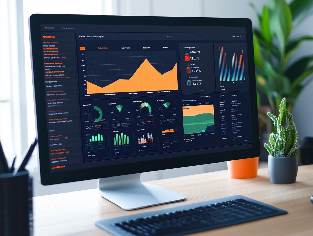
User-friendly CRM dashboards are crucial for a successful CRM strategy, as they improve user satisfaction, efficiency, and decision-making. Design, customization options, and intuitive navigation are key elements of a user-friendly dashboard that should be considered during development.
To create a user-friendly CRM dashboard, understanding user needs, utilizing data visualization, and regularly updating and maintaining it are important best practices.
The Importance of User-Friendly CRM Dashboards
User-friendly CRM dashboards are essential in contemporary sales management, providing the tools you need to track metrics, analyze performance indicators, and gain valuable insights that drive revenue growth.
With thoughtfully designed dashboards, you can visualize crucial sales metrics, including closed deals. This clarity supports strategic decision-making for both top executives and sales representatives.
Real-time updates elevate your user experience, empowering your team to adjust sales objectives based on the latest data analytics, ultimately optimizing your sales pipeline for greater efficiency.
Why User-Friendly Dashboards Matter
User-friendly dashboards are critical for CRM software, offering you a clear overview of your performance metrics and empowering you to make informed decisions through intuitive visual data representation.
These dashboards are crucial for transforming complex data into easily digestible visuals, allowing you to quickly assess your progress toward targets, monitor customer interactions, and spot trends over time.
With customizable views that highlight key performance indicators, effective dashboards enable you to focus on actionable insights. This makes it easier to adjust your strategies in real-time to drive sales growth.
Their capacity to integrate real-time data fosters collaboration and accountability, significantly enhancing your overall performance and laying the groundwork for strategic planning in sales management.
Key Elements of a User-Friendly CRM Dashboard
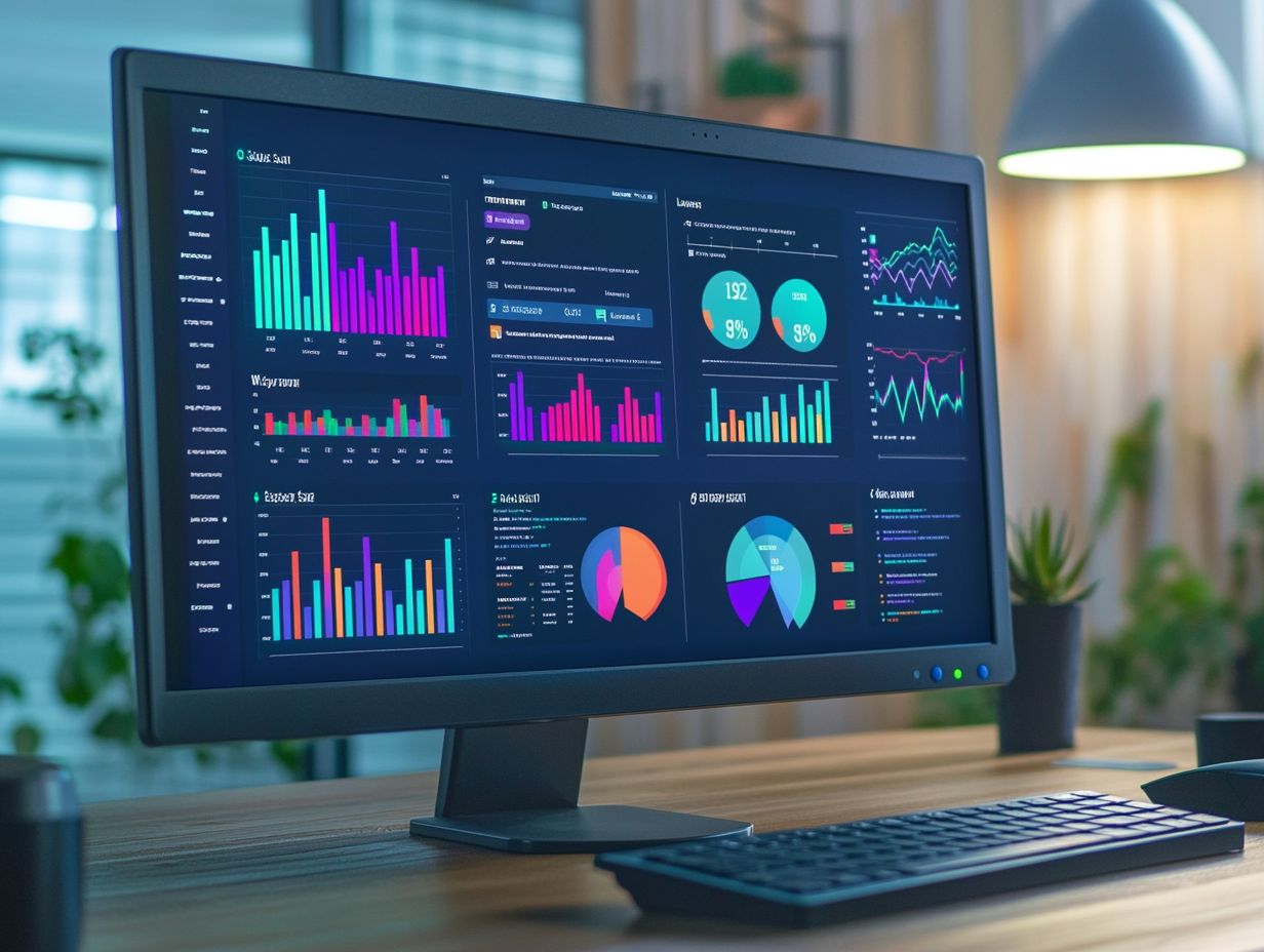
A user-friendly CRM dashboard stands out through its design and layout, emphasizing intuitive navigation and efficient customization options. It should effortlessly present visual data that is easily interpretable, catering to everyone from sales representatives to top executives.
Design and Layout
The design and layout of your CRM dashboard play a pivotal role in its effectiveness, shaping how visual data is presented and how effortlessly you can access CRM reports.
A thoughtfully curated color scheme can evoke the right emotions and direct your attention to key metrics, while consistent typography enhances readability and exudes professionalism.
Adequate spacing not only reduces clutter but also creates a more intuitive user experience, allowing you to navigate seamlessly through different sections.
By prioritizing essential sales metrics in an organized layout, you foster meaningful engagement. This strategic approach empowers you to quickly identify trends and insights, making it easier to draw actionable conclusions that ultimately drive sales and strengthen customer relationships.
Start implementing these strategies in your CRM dashboard today!
Customization Options
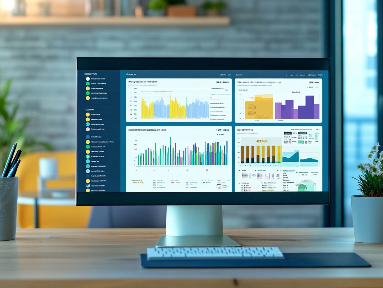
Customization options in a CRM dashboard empower you to tailor your experience. You can modify sales metrics, user permissions, and layout to meet your specific business needs.
This flexibility enables your team to prioritize the most relevant key metrics, such as lead conversion rates or customer engagement levels, ensuring immediate access to data that drives decision-making.
For instance, platforms like Salesforce offer easy drag-and-drop features, allowing you to rearrange dashboard components with ease.
HubSpot, on the other hand, lets you create custom reports that highlight unique trends, providing deeper insights tailored to your operational requirements.
These features not only enhance user satisfaction but also significantly boost productivity, allowing your team to focus on strategic objectives.
Intuitive navigation is key to a user-friendly interface in your CRM dashboard, ensuring effortless access to key features, analysis of activity ratios, and monitoring of your sales pipeline.
Well-structured menu designs categorize tools logically for quick access to essential functionalities.
Shortcut accessibility streamlines your workflow, giving you the power to save valuable time while focusing on important tasks.
Robust search functionalities make it easy to find specific metrics or client information, enabling instant tracking of crucial details.
Together, these elements create an environment where you can concentrate on achieving your objectives, ultimately improving efficiency and productivity in reaching your targets.
Best Practices for Creating User-Friendly CRM Dashboards
To create user-friendly CRM dashboards, you must fully grasp your users’ needs. This requires effective data visualization techniques and a commitment to regular updates that keep the dashboard relevant and useful over time. For more insights, check out this guide on optimizing CRM user interface design.
Prioritizing these best practices enhances the overall user experience and ensures the dashboard remains a valuable tool.
Understanding User Needs
Understanding user needs is essential when designing a CRM dashboard that meets the expectations of sales team members and aligns with their daily performance metrics.
By actively engaging with users through customized surveys and feedback sessions, you can uncover the specific features and functionalities your sales teams value most. These insights are crucial data points guiding your design choices, ensuring the dashboard addresses real-world requirements.
When sales professionals feel that their unique challenges are recognized, they are much more likely to embrace the CRM tool. This user-centered approach not only enhances usability but also elevates overall sales performance and boosts team morale.
Utilizing Data Visualization
Utilizing data visualization techniques in your CRM dashboard can transform complex sales metrics into visual formats that are easier to interpret, resulting in insightful reports that enhance strategic decision-making.
By employing a variety of visualization methods such as charts, graphs, and heat maps you can quickly attain a comprehensive view of sales performance trends.
These graphical representations provide immediate insights, simplifying the process of identifying key growth areas or potential challenges. For example, a heat map can vividly illustrate regions where sales are thriving compared to those needing additional support.
This gives you the power to adjust your strategies based on these visual insights, optimizing your approach for even better results.
Start customizing your dashboard today to see immediate results!
Regular Updates and Maintenance
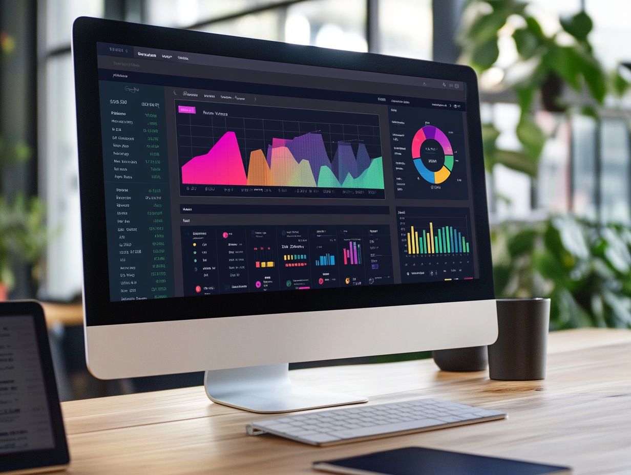
Regular updates and maintenance are crucial for keeping your CRM dashboard user-friendly. This ensures that your sales metrics are always current and that the interface remains optimized for user engagement.
By prioritizing routine checks, you can effectively update your data, refresh designs, and incorporate valuable user feedback. All of these elements play a critical role in maintaining the relevance of your dashboard. This ongoing maintenance enhances the overall efficiency of the dashboard and significantly boosts user satisfaction.
When users feel that their needs and suggestions are acknowledged and acted upon, they are more likely to engage with the system positively. This leads to improved productivity and better decision-making. Ultimately, a well-maintained CRM cultivates a more robust environment for tracking and analyzing sales performance.
Tools and Resources for Creating User-Friendly CRM Dashboards
You have access to a wide array of tools and resources designed to help you create user-friendly CRM dashboards. This includes CRM platforms that boast intuitive dashboard features and specialized data visualization tools tailored to elevate your experience.
CRM Platforms with User-Friendly Dashboard Features
Leading CRM platforms such as Salesforce, HubSpot, and Freshworks offer intuitive dashboard features that are crucial for effective sales management and data visualization.
These dashboards present data in a way that’s easy to digest, allowing you to interpret key metrics at a glance. They empower your teams to customize their views according to specific needs.
As a sales professional, you can effortlessly track your performance against targets. Meanwhile, managers can generate detailed reports that reveal trends and uncover opportunities.
The true strength of these CRM systems lies in their unique capabilities that go beyond mere data display. They incorporate interactive elements that nurture deeper engagement and understanding.
By tailoring user experiences and integrating real-time analytics, these platforms enable you to make informed decisions swiftly, enhancing your overall productivity.
Data Visualization Tools
Data visualization tools are essential for enhancing the way you interpret visual data, empowering you to extract meaningful insights from performance indicators right within your CRM dashboards.
These tools allow your sales team to swiftly identify trends, monitor key performance indicators (KPIs), and make informed decisions based on real-time data analysis.
Many of these solutions come equipped with features like customizable dashboards, user-friendly drag-and-drop interfaces, and robust reporting capabilities, simplifying the visualization of complex datasets.
By seamlessly integrating with popular CRM systems, these tools eliminate data silos, ensuring you have a comprehensive view of customer interactions and sales performance at your fingertips.
Generating insightful reports becomes easier and more impactful, paving the way for strategies that drive growth and enrich customer relationships.
Training and Support Resources
Training and support resources are essential for your success! They help you make the most of your CRM dashboard for analyzing data and performance tracking.
Without these crucial tools, you may find yourself struggling to navigate the software, missing out on valuable insights, or underutilizing features specifically designed to streamline your workflow.
Comprehensive training programs equip you with the knowledge needed to operate the CRM effectively and instill a sense of confidence, enabling you to adapt swiftly to new functionalities.
Well-structured support materials can elevate your overall experience by providing guidance that addresses common challenges you might face.
Investing in these resources now can help drive sales performance, ensuring that your team is well-prepared to cultivate lasting relationships with clients and optimize sales strategies.
Frequently Asked Questions
What is the purpose of creating user-friendly CRM dashboards?
User-friendly CRM dashboards simplify data viewing and analysis. This helps users make informed decisions and take action quickly.
What are some key elements to consider when designing a user-friendly CRM dashboard?
Consider the target audience and the data type when designing. A clear layout and the right visuals, like charts and graphs, matter too.
How can I ensure that my CRM dashboard is user-friendly for all types of users?
Test your CRM dashboard with a variety of users. Their feedback will help you spot problems and improve usability.
Are there any best practices to follow when creating user-friendly CRM dashboards?
Keep your dashboard simple and clean. Use consistent colors and branding, and make navigation easy.
What are some common mistakes to avoid when designing user-friendly CRM dashboards?
Avoid cluttered layouts that confuse users. Don t overwhelm them with too much data. Always consider your audience’s needs.
How can I measure the effectiveness of my user-friendly CRM dashboard?
Measure your dashboard’s effectiveness using metrics like user engagement and time spent. Regularly analyze these to ensure it meets your goals.
